Pill Toggle With Icon 1
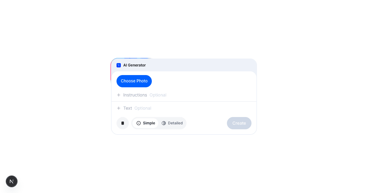
Animated pill toggle with icons that slides between options with smooth spring physics. Component used in Colouring Page.
Installation 30s
Run Claude Code then copy and paste this command
Sign In to Build
Join with a free account
Claude Code will install this into the /src/components folder in your project
Tell Claude Code where you want to use this
Description
A pill-shaped toggle switch with icons and labels that smoothly animates between states.
The white highlight slides behind your selected option with spring physics that feels responsive and polished. Each option gets an icon and label, both customizable through props.
Pass in your own options array to create custom toggles for view modes, filters, or any binary/multiple choice selection. The component tracks state internally but also fires onChange callbacks so you can sync it with your app state.
Built with Framer Motion for buttery smooth animations and Tabler Icons for the default icon set.
Key Features
Use Cases
Frequently Asked Questions
Your Idea to AI Business In Days
Join Dan, Zehra and 0 others building AI businesses in days with video tutorials and 1 on 1 support.
Used In
Dependencies
These will be automatically installed when you add this component to your project.
 Member
Join 0 others building with AI